Saturday, 25 February 2012

DigiPak Analysis : 30 Seconds To Mars A Beautiful Lie

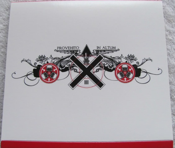
 This Digipak is for the band 30 Seconds To Mars' Album A Beautiful Lie, it is a alternative rock/ post-hardcore album, it is a CD - DVD pack with MTV live and unplugged sessions.
 the colour scheme of the album follows the bands colour scheme or red, black and white, and the albums artwork is very unique and follows the theme of a alternative rock band, with dark provoking images.
 the booklet found within the digipak gives information on the songs and the band and features pictures of the band. all wearing black with a red and white backdrop.
 the pictures within the booklet are in colour but the blacks, whites and reds have all been emphasized, with the contrast turned up quiet high.
the digipak opens up in a cross shape revealing the cd and dvd and booklet with the lyrics to all the songs written on the backgroung, in a small text and repeating with mars army written above


this is a good digipak for the style of music the band plays, it stick well to the bands theme, and represents the music they play very well.

DigiPak Analysis : Guns N Roses Greatest Hits

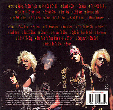
 This is the Guns N Roses, Greatest Hits digipak, its a two cd set of the guns n roses best selling singles, on the front cover it has the guns n roses symbol, which is synonymous with the guns n roses, the backgroung colour is a simple gun metal grey, so the focus is on the symbol and the guns n roses name.
 the back has a picture of the band, with the song titles above them, the picture was taken during the eighties when the band was still together, even though the digipak came out in 2004, so the rest of the digipak follows this theme, so all the text and images are all similar styles to ones found in the eighties.
the inside has more pictures from the eighties, and the two cds have the same symbol as found on the front this time in colour from the way the band is dressed and the styling of the digipak its easy to see that this is a hard rock band.


This DigiPak is Very impressive the front gives an idea of class and importance by being simple and unassuming, whereas when opened its easy to see the music style and the genre of music within.

DigiPak Analysis : Hugh Laurie Let Them Talk Special Edition


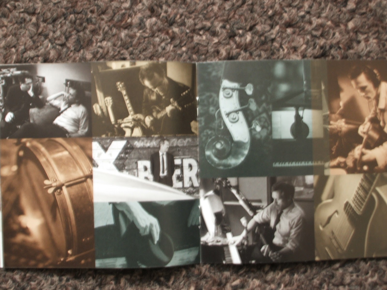
 This Digipak is the special edition version Hugh Lauries album let them talk, it is an extended version of the album and comes with a dvd included, of live recordings and the making of the album
 also included in the digipak is a small booklet about the artist who he covers, information on the band and each song and who recorded what part of the song.
 this album is in the style of new orleans blues, so the digipak is in black a white, as when most of the music covered in the album was originally played at a time when there was only black and white pictures and television, and the album is mostly acoustic music, so the digipak is style to be very soft and ambient.
 also to follow the style of music which he plays the digipak is very minimilist, in the scence that there isn't an abundance of pictures, showing pictures of new orleans, not only the birthplace of the style of music but also the place where the album was recorded.
 within the booklet there is a greater variety of colours but even then they are either soft pastel colours, like light green. orange and blue, and some of the pictures have a sepia effect to them.
overall the digipak is a great representation of the album within, from the outside its easy to see that it will be easy listening music, not overbearing or garish

Monday, 20 February 2012

Tour Poster Analysis : Them Crooked Vultures


This Tour poster is closer to a "standard" tour poster, with the artists name at the top followed by a picture relating to the artist, then tour dates and information about the tickets, the tour poster style is distressed or vintage which is currently a popular design type of the crungy blues music that they play.

the picture os of 3 men in suits with vultures, this works well witht he bands image as it is a three piece band, and the man in a suit with a vultures head is similar to the album cover art.

Tour Poster Analysis : Foo Fighters


This tour poster is pretty unique in the scence that most tour poster have tour dates on whereas this one doesn't have any tour dates, it has the bands name, then a picture that is slightly degregated which is similar to most of the foo fighters album art and poster art, the vintage distressed look, the artists name is clearly shown at the top of the poster.

as a poster its not very effective as it gives no dates, no venues or no information on buying tickets or even websites or phone numbers to get the tickets, this gives the impression that further research is necessary for purchasing the tickets.

Tour Poster Analysis : Joanne Shaw Taylor


This Poster is different to most other posters, most posters have the artists name at the top, which this one does, but usually underneath the artists name is a picture of the artist or and image synonymous with the artist, where as in this one underneath the artists name is all the tour night they are doing, then underneath that is the artist picture,

the image itself is not of the album cover art but a picture of the artist performing, taken from the last tour, usually album cover work or the band posing would be on the poster but in this case it is of the artist performing.


Thursday, 16 February 2012

Final Draft of DigiPak


After much consideration on how I would closen the connections between my final digipak and music poster, I came up with sticking to the theme of peace and war. In doing so, I took a picture of a bullet and decided to use that as part of our digipak. Next I went into photo shop and duplicated the bullet a number of times, I then created one half of the peace sign using the bullets. I took another picture of the bullet, but facing the other way and duplicated it a number of times and created a circle (the other half of the peace sign), now the bullets look like they're going to collide. The first half by going through the second half, suggesting that at a certain point in time the bullets will come together and create the peace sign.


I also drew the peace sign (see below) and scanned it into the computer, then I split it up in half and put it on seperate pages, this allows for the peace sign (which was coloured in the same colour as an axolotl) to be full when the digipak is put together, it also suggests that we do not have world peace, as of yet, and that certain places need to be fixed to get world peace. These pictures replaced the images on my first draft of the sun and the moon.

As for the text, I've kept it the same, however I have added production and copyright information on the back cover, which is found in my research on various digipaks. As for other text, I have added some memorable lyrics: "Can't the whole world love one another. Throw down your weapons fix all the hunger". This is to show what this album means to the artist and gives us something to think about.

As for the final page, I have added the peace sign so that it fits exactly where the CD would fit, this is what "The Axolotls" want, they want Peace, not war, and so this suggests that there should be peace in this world sometime in the future.